http://www.matthewxrichardson.com/index.html
This is an illustrator i found while researching illustration. I really like the way he uses colour as i think it makes the book or editorial design stand out. Shouldnt illustrations stand out? I think so, people do judge a book by its cover before they read it dont they whether they admit it or not. I prefer bright bold colours as they feel more positive and have more energy
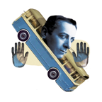
Some of his editorial illustrations add images on top of each other, such as the bus with the hands and the face. I think this makes the image alot more interesting. Abstract images always grab my attention. The image must have been put together in that way for a reason as thats what illustration is all about. with the images he produces it makes me think rather than just glance at a boring picture.


No comments:
Post a Comment