Thursday 24 January 2013

Is this really a Primary School?


In my opinion I would be calling this building a Playground rather than a Primary School!
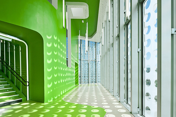
This Primary School is L'ecole polyvalente Claude Bernard Primary School.

Children respond very well to design, colours, shapes and imaginative spaces, maybe this kind of space makes them work harder or help them think of ideas more quickly.

The exterior of the building is etched glass with a repeated pattern of small circles this then reflects onto the interior of the building and creates a theme around the whole building a clever way to create a pattern don't you think, using light and shadow?

inside the spaces are full of colour, to help identify areas and direct where the children should go. Children react well to these kind of signs so it could make it easier for the adults.

the more i read about this Primary School the more I understood the Relevance for the Bright and crazy colour designs, Children will definitely react in the right way whereas at first I thought the children would just get distracted by them. 
A very clever design by the architects. Bravo.

Sky High


Situated on the 56th floor of the Montparnasse tower, the Ciel de Paris restaurant makes an awe inspiring amber glowing statement on the Parisian Skyline.

The room is circular so it focuses on circles in its design using light shades with a glowing gold ring around them and circular chairs and sleep curved tables and a bar. 
This room is incredibly chic and so modern for only the most upmarket of customers with a fabulous view of the Eiffel Tower. 
I love how the lighting seems to create a soft and sophisticated mood in the whole room.
It also seems to have a very futuristic feel to it , such like Star trek with the quiet ambiance of looking over Paris from above. This sleek and seductive stylish design lets you enjoy Paris like never before.

who wouldn't want to go there? someone take me?


For more fabulous Restaurant Interior Examples look at this website where I found the Ciel de Paris.
http://q8concierge.com/category/restaurants/page/2/

Sheung Wan Hotel

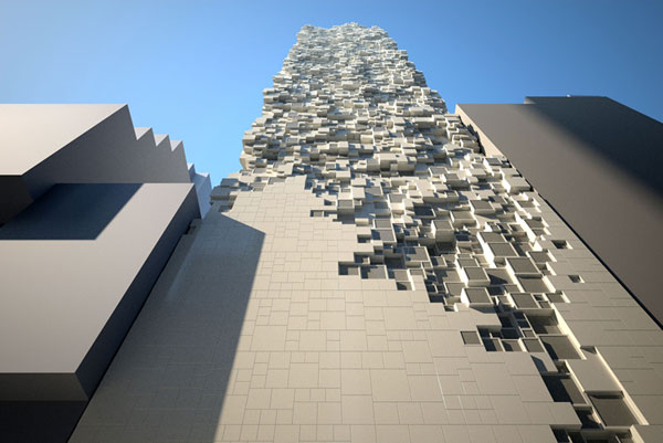
I found this crazy building which is as crazy on the outside as it is on the inside. A perfect example of how an architect has looked at both the inside and outside.


It is known as one of the most iconic buildings in Hong Kong upon completion and was built by architectural guru DISTRICT'S , Lucid Rich ltd and top architect Thomas Heatherwick. It consists of 300 rooms.

I really like how half of the building is a plain building look and then how as it ascends it looks like the building is crumbling apart leaving a textured surface of levelling squares, creating something very interesting to look at. All the squares are different sizes making the surface look even more jagged and even more impossible to build. how did they make this!


From the inside it sort of makes a feature wall by having different size windows at different lengths in the room. The textured wall adds to the design and invites you to look out the window at the Hong Kong skyline. The plain walls make sure no decoration takes away from the wall and keeps to a very modern feel. I would love to stay in this hotel, but I'm guessing its expensive.

Overdose Desk by Bulo

Overdose-desk-by-bram-boo-for-www-bulo-com-231x141x130cm-copyright-kris-druant-5-400

This Desk is part of the Carte Blanche Collection.

I saw an advert selling this desk in the Frame Magazine and I thought it was awesome, it looks quirky and fun but at the same time very organised and sensible. my work would definitely stay all safe and not get lost at this desk. 
It would be a conversation starter in my house when I'm older and I think everyone else should love this product design as well. 
Its something that looks like it shouldn't work but it does with flying colours.
Paparazzi 2007 h100xw70xd63cm-400Lazy 2007 88x187x60cm-400
Above are other designs in the same collection.

Random International, Barbican Art Gallery London


This Rain room is set in the Barbican Gallery in London and has been quite a spectacle for many tourists. I first saw it in an exhibition article and it really excited me to go and take a look for myself.
Don't worry you don't need a spare set of clothes, this rain room is designed to envelop wary walkers in a torrential, body reactive deluge that doesn't touch them but provides an experience both spiritual and technological . "information took from the Frame Magazine."

This was one of my favourite Gallery visits that I have been to recently as I am quite a Kinesthetic and visual learner. Your brain doesn't quite understand whats going on as you aren't getting wet but you recognize its raining. You just have to go along with it and I found myself feeling like I was free in a world of my own, like you were in a dream. 
This definitely had the wow factor to me, it was art but a different kind of art, using technology it really involved your senses and let you create your own imagination with it.

How does it work, go find out for yourself.

The exhibition is on until the 3rd of march 2013

Ross Lovegrove New Design

Futuristic/primitivism/insticitve override

Bit of a mouthful to start with and doesn't it make you think what on earth is that?

well its definitely worth a look, I first saw this in the Frame Magazine Issue Jan/Feb 13 and then looked it up online and found this video showing how the light works.

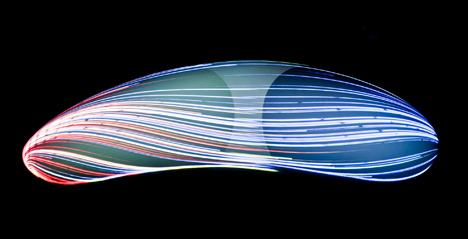
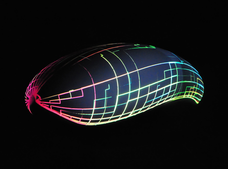
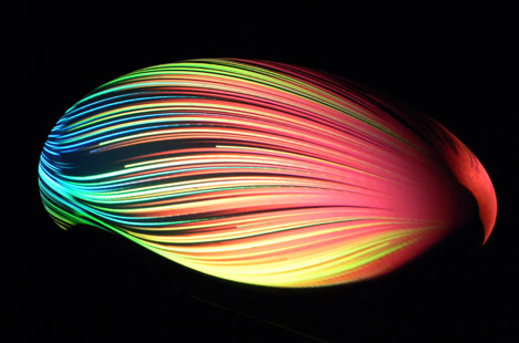
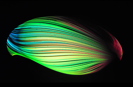
This concept is a new futuristic vehicle designed to trigger an instinctive response to its organic form instead of science.
Futuristic Primitivism/Instinctive Override by Ross LovegroveFuturistic Primitivism/Instinctive Override by Ross LovegroveFuturistic Primitivism/Instinctive Override by Ross LovegroveFuturistic Primitivism/Instinctive Override by Ross Lovegrove

He showed off his design at the Interieur Design bienalle in Belgium with video projections.
he worked with Italian engineers to create the streamlined form. the images that projected onto the blobs surface reflected the technology that went into the transport design.

http://www.dezeen.com/2012/11/01/future-primitives-concept-carinstallation-by-ross-lovegrove/ follow this link for more information and quotes from Mr Lovegrove himself

I think this is such a fantastic design which will certainly get Design geeks attentions. I think the colour against the black ground makes a certain impact on its own even before you know what it is. who knows maybe this is the future of our transport.

Habitat Project


One of our main projects for this term was based on small spaces and what we could create inside them. I focused on creating a habitat for 2 people.
I looked at erosion and decomposition as mystarting points to create a shape that was interesting even if it was small.  I focused on curves and layers, and then thought about the location, looking throughbooks I found the idea of it being hanged in the trees or off a building and researched into some buildings that hd been built in a similar way
I then came to the conclusion of small pods multiplied and stuck to the edge of a building, therefore not using any space up on the ground just the unused space in the air above.

Above you can see my design ideas for the shape of the building and above that my idea of the layout using projection and plan drawings. This gies you a good visual of what the interior of the building would look like.

I really enjoyed starting to create my on environment and starting completley from scratch but I think I was quite hesitant and need to next time jump out my comfort zone and create something even more wacky.
My inside of the building was quite plain and simple, this should have been more exciting.

I would also like to start using photoshop and rendering as Ive shown in my blog before to create a definite image and a more professional look.

Trace Elements project


For our Design Visulisation Course we were given the project based on Trace elements.Things, shapes, objects that have been left behind by humans,the weather etc. I looked around college and found lots of marks everywhere, it was surprising how many there were and what interesting shapes i found.

I then took these Shapes and textures I collected and started to work them into some sort of design prospect. I wanted to focus on some kind of installation or sculpture to coninside with my interior design future.


Here I looked at seporators in a gallery instead of a boring wall, installations of rivers, maybe fountains and different sculptures for bridges. These would work as fabulous architecture.


 We took some time to create our own shapes using light drawings, and not knowing what we were going to produce we came out with some really interesting shapes that we could use.


I made collages with vector drawings, and one of my found shapes to come up with ideas for whay these shapes could be used for. I really enjoyed creating these collages as I'd never done them before and they created an interesting visual that could produce even more ideas.

Ive now Finished this project after doing lots more designs to do with an interior sturcture or sculpture that could go inside some sort of builiding including lights , tables chairs, elevators, entrance ways and doorways.


My final idea was a staircase that was created out of my trace elements shapes twisted round. I decided a good place for it to be placed would be inside a cave, letting you get to different areas of the cave to look up close to it, if someone was to renovate a cave.


My final project which I'm sure I'll blog about soon will now be on the idea of renovating a cave and creating a stucture within a structure. This Trace elements project has inspired me and will continue to inspire me through the Final major project as I wish my trace element shapes will help me come up with a design.

Rendering


Artistic Rendering is adding colour, creating shading and texture to an image. thus makingthem look more realistic and more easy to imagine to the viewer or client.
Rendering can also include creating 2D designs to show the proposed architectural design.
It can be used to show motion in 3D models or even to create expressive styles.

For interior design this can be used in drawings or on the computer tocreate a good visual for emplyers/clients/ or emplyees to see. Looking at materials, colours and where shadows will fall.

This video shows the process of rendering and an example of how to render a car, one day I hope I can render aswell as this.


3rd Angle Drawing


At college recentley we have been practicing our drawing skills and learning new technical drawing techniques.
This above is 3rd Angle Drawing, where you draw an object in plan view, side view and front view usin a set square. This I found the easiest of the technical drawings as its easy to see the image in your head whilst your drawing it.

I drew a plug as my first attempt as it was relativley easy shapes. drawing round the outline in a black fineliner makes the drawings alot more defined and sharp.
I need a bit more practice to get them up to scratch but I've made a good start.


Tuesday 22 January 2013

Artist pages

Throughout my art education I have had to research Artists and have copies of their work and what I think of their work in my sketchbooks.

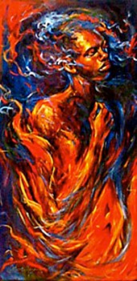
This Artist is one of my favourite artists I came across researching into colour and portraits in my first year of A Levels. Kathy Ostman Magnusen


I loved how she used colour on the faces, making them seem like angels and not real people, some look like they were on fire or bursting with energy and this really fascinated me, It gave me the idea of my final piece of my self portrait painted with lots of different colours to show my personality.

The painting on the right is my own version of one of her paintings and is definitely my favourite as i think my face looks really realistic. painting with all the colours was alot of fun.

other works.

Seating Project - College

For our first week in 3D Design specialism we worked on a project close to home, an open space at colllege where we were to design a seating area for the students.

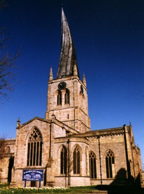
we wanted to research into something to do with chesterfield so we looked at the crooked spire and thought about the shape of the spire to be our first thought.
our second thought was how the wood interlocks in the crooked spire and we thought this wood could become our seats if it was different blocks on top of each other at diffferent angles, creating seats.


so we designed a tower of seats going up in an angle, the material wood didn't seem such a good idea as it might not be able to cope with the weather or students could damage it so we instead thought about using clear plastic, durable not as expensive and easy to clean.


Oscar Niemeyer

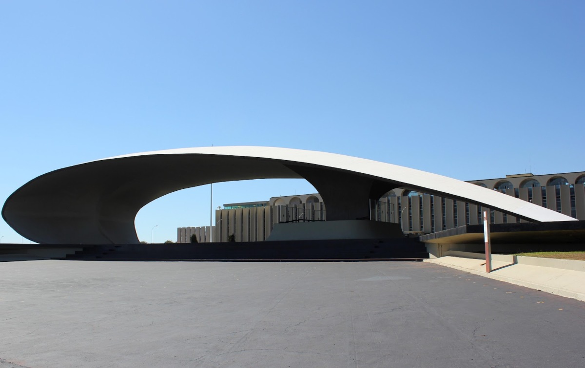
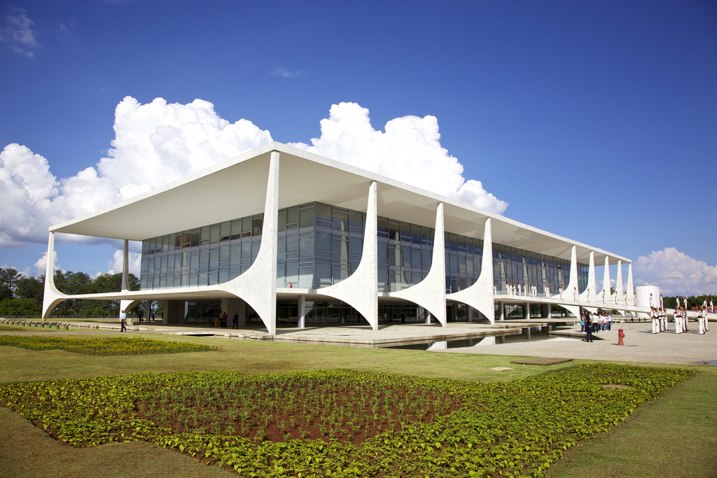
Oscar Niemeyer was a Brazilian Architect who designed some of the most amazing 20th century Buildings. Sadly he died on December the 4th at the age of 104 years old.

here i have picked out a few of his designs to hon our him and look at how we can build from what he has showed architecture in the world.

His style was not to everyone taste, some people said his work focused on the architectures form than on its functionality or inhabitants.


His designs are so incredible looking, with big sweeping curves or abnormal shapes joined together to create a building. usually white in colour makes them stand out alot from the surroundings. I really like his designs as they catch your attention and almost look like they were fun to make.


RIBA Stirling Prize 2012

There are many awards out their for the best Architecture and Interior in the country and this is one of them we came across in a lecture at college.  The RIBA Stirling award.
It is named after James Stirling, the great British Architect who died in 1992. Every year the prize is presented to the architects of the building that has made the greatest contribution to the evolution of architecture over the past year.

This video is 10 years in the RIBA Stirling Prize and holds the winners of past years. take a look:
http://www.youtube.com/watch?feature=player_embedded&v=Hxa_xCZqRVk


Winner 2012
Sainsburys laboratory , by Stanton Williams


An Architectural promenade forms the heart of the building, which focuses on botanical research being situated next to the botanical gardens at the university of Cambridge  from the front to the back the building progresses from a grand colonnaded facade to an open balcony and glazed public cafes.

the building is an exciting new space for research.

I really like this building as it looks clean cut and fresh with the environment around it and i think it fits in really well to the surroundings. with the repeated panels in front of the windows it gives it a symmetrical look and a nice square finish. I would agree with this being a piece of special architecture.

Monday 21 January 2013

Steve Jobs

Technology is a big part of our life and especially in a designers world, business is also very important  So I thought I'd take a moment to look at the Well known Steve Jobs. 
Shoulder-high portrait of smiling man in his fifties wearing a black turtle neck shirt with a day-old beard holding a phone facing the viewer in his left hand

Steve Jobs was born in February 24th 1955 and died recently on October 5th 2011. He was an American entrepreneur and was most famously known for being the co founder, chairman and CEO of Apple.

He is widely recognized for working excessively on the computer revolution, also working with Pixar and Walt Disney. 
He was the man involved in the making and remaking of the Apple Iphone, Ipad , Ipod and all sorts of other devices that the world came to love and become obsessed with. This made Apple a multi million pound company all across the world.

For me Steve Jobs is a guy anyone can look up to, to acknowledge his business skills, his ability to take risks and look forward to the future not the past. I certainly respect his work and think everyone should listen to his words he said and use them to create their own legacy.

FRAME magazine


Frame is a publication magazine that I came across in the Library at College and I have fallen in love with it. With Interior Design being my main interest for my future, this magazine is full of tonnes and tonnes of examples of new up and coming interiors and their designers.
It also looks at Furniture and product design which is very much involved in an interior designers world and career.

In the new issue Jan/Feb13 there's articles from lighting designer Sarah Landau, LED maestro Tom Jenkinson  and Musician Amon Tobin talking about how light projections can turn music into a physical entity.

I have never fallen in love with a magazine more! make sure you look it up on the internet, in your nearest library or subscribe. I'm definitely going too.

http://www.frameweb.com/

A Level Work - Women in Soceity

 For my A level Coursework Project I wanted to look at an issue that even I see alot these days. How women are perceived in society. The sexism and feminism game.

These are a few of my art pieces from my sketchbook that I have photographed.

My first one is of a man doing the cooking instead of a woman, it was supposed to symbolize and ask the question, does this look weird and if so why? why cant men do the cooking?

It was created out of water based oils and I'm really happy how it came out, the projections have worked out well as well as the models face as he looks pretty realistic.  I really like how easy it is to create tone with water based oils.
 These for images are Collagraph prints and show a mans hands doing the dishes. Is it wrong to see mans hands in the dishes? should it be women?  why is there such a divide between men and women jobs.

I am really happy with these prints, as the dark tonal parts have really worked and stand out from the picture creating a 3D effect with lots of texture.
The image that i cut out I feel has come out really well and its easy to see what it is.

 These pictures were to display women anger in always having to do the housework. The model is covered in ironing getting angry as there is so much to do.

I tried it out in two different medias, pen and ink to create a monochrome image and in colour with water based oils and collage as the ironing to emphaises the use of materials.

i prefer the black and white image as it looks alot cleaner but I really like them both together as one piece as two of the same image can add a larger impact plus different colours make it seem busier and gives you more to look at. Audiences will be more interested in it.


my last piece was of a woman doing the cooking but getting angry whist doing it, here she is screwing up kitchen towel and looking angry at the recipe book as well as the worktops are looking messy. why should women be getting angry when men are doing nothing?

i did this piece in charcoal and I really like the effect it has made. creating tone is very easy making it easier to make objects more 3D. the use of charcoal seems effortless and doesn't take much work.

I'm happy at how the face turned out as it was difficult to get the right angles to make it look in proportion however I think I managed it and it looks like a real person.

Life Drawing Pieces

Ive just got my Life Drawing work back from Moderation so I thought I'd share my work with everyone.

 This painting was created with water based oils, and I am pleased with how this one turned out, we had to start with the paints lightly and gradually build up town using greens and browns. I think i created the tone very well and brought out the 3D Shape.

The Background was too white so we were encouraged to add a darker background to emphasise the light and make the figure stand out more.
 This piece was just a simple pencil drawing, where we worked with cross hatching to create the tone on the figure. I really like how clean and simple it looks with just the precise markings and no untidy marks.
This piece included foreshortening as the legs come towards your line of view making them look smaller, this was a hard technique to master but its worked pretty well here.
Ive also worked into the face a bit more making her look more 3D and realistic.
 This Picture is of a large scale, and we used the process of covering the whole piece of paper in charcoal and then rubbing out the charcoal to create marks in a negative image.
Doing it the opposite way round was harder than I thought but I soon got the hang of it. I found it harder to create the tone but in the end I think I've managed a good piece of work.
I really like the sheet that's draped over the chair as the creases and shadows look realistic.
One thing i would say though is the woman looks really scary! I don't think I meant to do that!
This Picture was created by a mono print  we had 3 minutes on each figure and had to overlap them on top of each other. this was pretty difficult as you couldn't see you final image as it was on the other side of the paper. It was only at the end which we could see our final print.
I like how they overlap as its alot more abstract then just one figure on a page and there's alot more to look at.
it gives you the full view of the model from front to back making him more real. I could work on the detail however and the amount of tone and where i place it on the figure.