Sunday, 11 November 2012
Animation created on the Ipad
In class our tutor showed us how technology is moving on and how animation can be created anywhere by the people who know how to use the specific apps.
he showed us this video which was made my the Ipad and drawing onto an animation app.
http://www.youtube.com/watch?v=vnWWp-Mac_E
this really proves how easy technology is now and how easy it is to get hold of real professional equipment on devices we have at home, even in the art world.
Ipad Drawings
My Ipad Paintings on the App : Brushes
 using some of the students in the class we drew each other in quick drawings to get used to the ipad and the app Brushes.
the app really lets you use the page like your painting , but you dont have to wait for the paint to dry and you can work over the top of your work over and over again to make it look more realistic.
on this picture to the left i tried to focus on the jacket to make it look as realistic as possible, i think i was getting there but there is still work to be done as it still looks quite cartoony. i need to work on mixing the colours together and not using block colours.
i started using nude colours here and trying to create the right tones on the body. i found it quite hard to create the right shapes though and i think it looks very cartoon like and nothing like real life.
this fustrates me a little as i like to be a perfectionist with detail on paper and with a pencil.
in all my sketches on the ipad i found it hard to get the right proportions for the body as there was alot of zooming in and out on the page. i think this makes a big effect on if the body looks real or not
all in all i dont think i achieved very much on the ipad as i dont think my drawings are very good. i think i need a bit more practice and a bit more patience!.
Life Drawing - Clay head
In life drawing we used the model but just focused on her head and features on her face by using clay. it was alot more difficult then i expected it to be, and was very hard to get started but once you had the facial structure you could add pieces to it until it started to look like a face.
i found it quite hard to smooth out the face but managed to pat it down in the end.
the hardest feature to get right was the ears, to get them in proportion with the face, we had to keep moving around the model to make sure we positioned them correctly.
overall my lips could have done with a bit more work as it looks a little like a moustache!
but i think my sculpture was a very good resemblense of her head, and seen as ive never done it before i was proud of my efforts.
3 Graphic Designers I Found
David Carson
http://www.youtube.com/watch?v=0eBhBPY7rdc&feature=related
http://www.davidcarsondesign.com/t/
Is an American Graphic designer and he is known for his innotative magazine design, and use of experimental typography.


i have focused on his work to do with Quiksilver the Surfing company. He was a very keen surfer.
he has designed surfboards and logos for quiksilver, including big bold colours and cartoon images.
the typography is always very interesting to look at aswell as it catches your eye. this is what a business should want to catch the attention of the audience.
the photo on the right shows one of his designs for Quicksilver. i love the use of colour and shows he explores his environment to find these backgrounds. the bright yellow is a much brighter colour than just using black and white
i also like how simple the drawing is but the black heart stands out so you can see that the cartoon character has feelings.
in a way you cant see what it shows so id like a little bit more detail as i dont know what this design is trying to show.
Peter and Paul


http://www.youtube.com/watch?v=0eBhBPY7rdc&feature=related
http://www.davidcarsondesign.com/t/
Is an American Graphic designer and he is known for his innotative magazine design, and use of experimental typography.


i have focused on his work to do with Quiksilver the Surfing company. He was a very keen surfer.
he has designed surfboards and logos for quiksilver, including big bold colours and cartoon images.
the typography is always very interesting to look at aswell as it catches your eye. this is what a business should want to catch the attention of the audience.
the photo on the right shows one of his designs for Quicksilver. i love the use of colour and shows he explores his environment to find these backgrounds. the bright yellow is a much brighter colour than just using black and white
i also like how simple the drawing is but the black heart stands out so you can see that the cartoon character has feelings.
in a way you cant see what it shows so id like a little bit more detail as i dont know what this design is trying to show.
Peter and Paul


peter and paul is an independent creative industry based in sheffield.
they have worked for tramlines 2012 and created logos for many comapnies such as working for creative england.
looking at the tramlines designs they use lots of dark colours but then use the accent colour red to make the work stand out. this attracts the attention of the audience. using images of music in the background relate it to the event of tramlines which is all about concerts.
using white and red writing also makes it stand out and easy to read.
i would like there to have been alot more colour as music is quite expressive so they could have expressed this through vibrant colours and it would have stood out to the audience alot more.
they seem to use a limited palette of colours but a very contrasting set of colours on their work so different letters or symbols stand out from each other. i really like this technique.
Wim Crouwel
is from the netherlands and is an inspiring figure in the world of Graphic design.
His ideas are very bauhaus related but he was fascinated by the ideas about serial and mass production.
hes designed magazines for museums and posters and catalogues etc.
if we look at his work, some is colourful some isnt. i prefer his colourful works.
he focuses on the typography of the pages. sometimes you cant really read the writing but its the design people look at as they know which museum its from.
the images above are my favourite as he uses very sharp colours, eletric blue and lime green together.
the backgrounds are very simple which makes you focus on the typography which i like.
i like how hes used the colours to create the 3D effect of the writing and not the main letter. the colpour association is all the way through which makes it easy for the audience.
Graphic Designers part 2
Pep Carrio
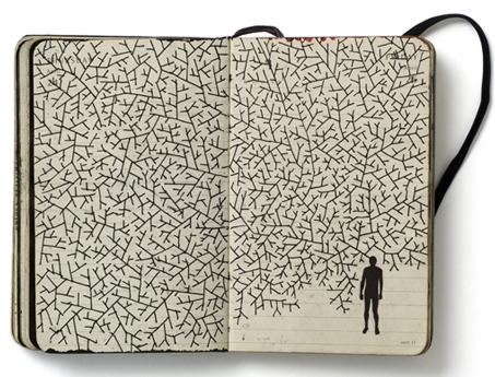

Pep Carrio is a Spanish artist and graphic designer.


Pep Carrio is a Spanish artist and graphic designer.
"A sketchbook is like a portable laboratory for me"
in 2007 he set himself the challenge to create a different image each day, this presents a daily record of his moods and thoughts.
In this laboratory of ideas he has “the freedom to experiment,” he says, “with no fear of failure … Anything goes.”
some of his work is very percuilar and rather weird at , i think where on earth did he get these ideas.
the top left image reminds me of a person and he has a maze to get through, does this mean that on that day he had alot on his mind that was getting on his nerves and panicking him.
i really like his work as it ovbiously shows how we was feeling on a day to day basis and we can interpret that from his works.
theres not always much colour involved as its focus is on the image and the composition he puts them in,
Graphics Designers
Stephan Sagmeister


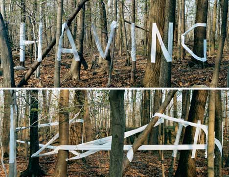
he is a New York based graphic designer and typographer who owns his own design firm.
Alot of his work is related to music as he has always been inspired by music, he has designed album covers for many artists including the rolling stones.
i am a big fan of his picture of his face with the words all on his face. this was an album cover for Lou Reed. it makes me immediately think that those words mean something to him specifically, and it makes me start to analyse his life and his personality.
some of his other works he uses typography and incorporates it into a background, i think placing the word Good into the tree is very clever.. however i find it difficult to realise why hes done this aswell as a few of his other works. i cant really connect with them.
the use of backgrounds and colours he uses do stand out though so i think it creates an impact on the audience which i think is important in graphic design.
Alan Fletcher


Alan Fletcher was a British Graphic Designer,
he was described by the Daily Telegraph as "the most highly regarded graphic designer of his generation, and probably one of the most prolific".
He is well known for the creation of logos, such as the V&A etc. these are now known all over the world through profile.
he had a very spirited and personal visual style.
his work on the zebra to me shows the obvious question... is a zebra white with black stripes or vise versa. which i think he has done very cleverly, he didn't even have to put the question on the page for me to interpret this.
his use of typography can be funny as well i find the wet paint sign fun to look at as the font interprets paint and colour. exactly what paint is .. dripping.
i really like his work and would like to look further into his work.


he is a New York based graphic designer and typographer who owns his own design firm.
Alot of his work is related to music as he has always been inspired by music, he has designed album covers for many artists including the rolling stones.
i am a big fan of his picture of his face with the words all on his face. this was an album cover for Lou Reed. it makes me immediately think that those words mean something to him specifically, and it makes me start to analyse his life and his personality.
some of his other works he uses typography and incorporates it into a background, i think placing the word Good into the tree is very clever.. however i find it difficult to realise why hes done this aswell as a few of his other works. i cant really connect with them.
the use of backgrounds and colours he uses do stand out though so i think it creates an impact on the audience which i think is important in graphic design.
Alan Fletcher


Alan Fletcher was a British Graphic Designer,
he was described by the Daily Telegraph as "the most highly regarded graphic designer of his generation, and probably one of the most prolific".
He is well known for the creation of logos, such as the V&A etc. these are now known all over the world through profile.
he had a very spirited and personal visual style.
his work on the zebra to me shows the obvious question... is a zebra white with black stripes or vise versa. which i think he has done very cleverly, he didn't even have to put the question on the page for me to interpret this.
his use of typography can be funny as well i find the wet paint sign fun to look at as the font interprets paint and colour. exactly what paint is .. dripping.
i really like his work and would like to look further into his work.
Graphic Magazines
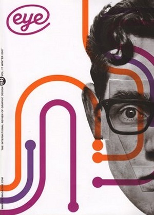 The Eye Magazine is the international review of graphic design focusing on graphic design and visual culture,
i really like this magazine as the covers always catch your eye and is full of bright pictures and examples of graphic design to inspire people.
http://www.eyemagazine.com/
Firstly i found an advertisement to an exhibition coming up. called PENCIL TO PIXEL
http://www.penciltopixel.org/
this forthcoming exhibition by monotype brings together the past, present and future of a unique typographic instutuition. spanning over a hundred years the expertise and craftsmanship of mono type has shaped the way in which we see and read the everyday world around us.
this would be really interesting to see and see how the company has changed over the years and show the audience how graphic design and typography which i am particularly interested in how its changed over the years
i will definitely think about going to see this.
Article of my choice
http://www.eyemagazine.com/feature/article/devil-in-the-detail
i found this article online about John Morgan who is known as a Typographer and Art director.
i found oit really interesting to learn what he does, look at some of his work as i'd never heard of him and see his opinion of what he does.
Typography
Drawing with text
In graphics its not just images that can be incorporated into an advertisement or poster. its all to do with the type on the page more than anything.
Typography looks at the different fonts , size , colour of the text on the design that's being created.
for example the word big would be produced as BIG whereas the word small would be shown as small.
it creates an image through the text, an audience can see the resemblense of the word with how it is drawn.
http://www.fontspace.com/
these are some drawings we did experimenting with typography, using tins and packaging of different things we found that each packaging has a different typography or even a selection of different typography designs. we used observational drawing and using different media , materials and our right and left hand we created our own copies of the typography.
my favourite is the "Whi" square. this qwas from the Whittard of Chelsea packaging and i really like the font that is used and how the W is so distinctive. using graphite created a simple and clean line which i preferred to the others aswell.
My metal box
In applied arts we experimented with all the metal processes to manipulate the metal and create different effects and shapes.
we added all our experiment pieces to a block of wood to display our work.
these are just a few images of my work.
i'm quite impressed with my work as i have never done anything to do with metal before and it was all new to me. DIY has never been a strong point so some of the processes like the blowtorch were quite scary. however i enjoyed it and got the hang of it in the end.
we scorched the block of wood as well to create an effect on the wood which i think finished off my box nicely.
i cant wait to use these processes again.
if i was to do anything different i would like to use more different
coloured metal to add some colour or add metal to the top to add bits that stick out from the box. add a bit of drama.
Applied Artists part 2
Jennie Gill


Jennie Gill is a jewellery designer that makes necklaces, rings, brooches out of precious metals, silver and gold set with enamels and stones. she also uses diamonds.
when i first look at her work i think they are beautiful , jewellery is always a soft spot for girls.
she uses such different materials on top of each other creating a great mixture of materials on one piece of jewellery, different colours also create a lovely look to her jewellery.
using unusual shapes on her necklaces also make the jewellery more unique. some of her metal designs like the top right picture makes it look quite sentimental, like those shapes on that bracelet have history and have been for something else in the past.
i really like her work and would even wear some pieces .
Adrian Sassoon


Adrian Sassoon is a ceramics art dealer that the art ranges from antique pieces to contemporary pieces. in ceramics they specialise in porcelain.
in my opinion i prefer the contemporary range as i am more of a modernist than into antiques, i feel there is much more interest in the shape of a item. so much more interesting and makes me think more of how did the artists make it. these catch your attention
however the antiques focus on beauty and especially on the painting onto the ceramics that can sometimes tell a story or just be a simple duplicate pattern.


Jennie Gill is a jewellery designer that makes necklaces, rings, brooches out of precious metals, silver and gold set with enamels and stones. she also uses diamonds.
when i first look at her work i think they are beautiful , jewellery is always a soft spot for girls.
she uses such different materials on top of each other creating a great mixture of materials on one piece of jewellery, different colours also create a lovely look to her jewellery.
using unusual shapes on her necklaces also make the jewellery more unique. some of her metal designs like the top right picture makes it look quite sentimental, like those shapes on that bracelet have history and have been for something else in the past.
i really like her work and would even wear some pieces .
Adrian Sassoon


Adrian Sassoon is a ceramics art dealer that the art ranges from antique pieces to contemporary pieces. in ceramics they specialise in porcelain.
in my opinion i prefer the contemporary range as i am more of a modernist than into antiques, i feel there is much more interest in the shape of a item. so much more interesting and makes me think more of how did the artists make it. these catch your attention
however the antiques focus on beauty and especially on the painting onto the ceramics that can sometimes tell a story or just be a simple duplicate pattern.
Applied Arts - Artists
Nora Fok


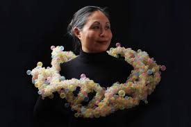
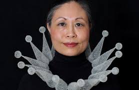
Nora Fok is an artist that is known for her beautiful and unusual designs for jewellery, her pieces are very delicate and intricate which is very instinctive to her.
She says that she is intrigued and inspired by the world around her asking questions and trying to find answers to them. she likes to relate to nature, structure, mysteries and magic.
her work usually takes a long time with lots of hours of work as they are quite complicated.
knowing this and looking at her work you can appreciate the ideas and the dedication she puts into these beautiful designs she makes.
to me they are very abstract and very original pieces of jewellery that you would never see anywhere else. using very delicate materials these create a very interesting texture as some look see-through. colour is not necessarily focused on but it is incorporated in some but they are usually soft pastel colours.
i love her work as it definitely has the wow factor, it grabs your attention and you want to look closer to see how it was made. although i would never wear it myself as i don't think its made for everyday use.
Junko Mori


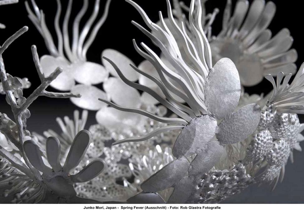

Is a Japenese silversmith and a modernist sculptor who works with metal.
her work consists of mainly hand forged pieces joined together in a form that is both organic and minimalist.
Her work seems to have a theme of these balls of steel rods all packed together and twisting in and out of each other to create a ball or big clump of metal. sometimes incorporating other shapes of flatter metal or balls of metal in different colours.
when i first saw it, it reminded me of an explosion. in another way when i looked at it again it locks in light and creates shadows which creates great colour differences on the sculptor.
i dont like her work that much as to me i cant see a meaning to it other than an interesting composition of metal. i can tell that this takes a lot of work to create but it doesn't excite me. however the big sculptures would be great to go and visit as i bet they have a massive impact on the audience because of their size.

Nora Fok is an artist that is known for her beautiful and unusual designs for jewellery, her pieces are very delicate and intricate which is very instinctive to her.
She says that she is intrigued and inspired by the world around her asking questions and trying to find answers to them. she likes to relate to nature, structure, mysteries and magic.
her work usually takes a long time with lots of hours of work as they are quite complicated.
knowing this and looking at her work you can appreciate the ideas and the dedication she puts into these beautiful designs she makes.
to me they are very abstract and very original pieces of jewellery that you would never see anywhere else. using very delicate materials these create a very interesting texture as some look see-through. colour is not necessarily focused on but it is incorporated in some but they are usually soft pastel colours.
i love her work as it definitely has the wow factor, it grabs your attention and you want to look closer to see how it was made. although i would never wear it myself as i don't think its made for everyday use.
Junko Mori


Is a Japenese silversmith and a modernist sculptor who works with metal.
her work consists of mainly hand forged pieces joined together in a form that is both organic and minimalist.
Her work seems to have a theme of these balls of steel rods all packed together and twisting in and out of each other to create a ball or big clump of metal. sometimes incorporating other shapes of flatter metal or balls of metal in different colours.
when i first saw it, it reminded me of an explosion. in another way when i looked at it again it locks in light and creates shadows which creates great colour differences on the sculptor.
i dont like her work that much as to me i cant see a meaning to it other than an interesting composition of metal. i can tell that this takes a lot of work to create but it doesn't excite me. however the big sculptures would be great to go and visit as i bet they have a massive impact on the audience because of their size.
Subscribe to:
Posts (Atom)


.png)


